Final Report
BYUI - ECEN 490R
Kyle Tolliver
Brother Rex Fisher
July 22, 2020
dt <- time %>%
  mutate(Time = as.numeric(round(`Time (decimal)`, digits = 2))) %>%
  select(Description, Time)
Introduction
I am a senior majoring in Software Engineering, I plan to graduate in December of 2020. Additionally I am getting an Applied Associates in Data Science. So this project is a data science type project and includes a software design and development aspect. Some of the Data Science courses I have taken include the following:
- Introduction to Databases
- Survey Object-Oriented Programming/Data Structures
- Data Intuition and Insight
- Data Wrangling, and Visualization
- Database Design and Development
- Discrete Mathematics 1
- Calculus 1
- Linear Algebra
- Introduction to Web Design and Development
This project helped me strengthen the knowledge I gained from these classes, while learning new tools, techniques and technologies of Data Science and Web Development.
I addressed the problem of unclear data on COVID-19. Many people see the data and can’t make sense of it and what the values mean. I also figured how much of the population has been tested. I compared the techniques used to fight COVID-19, methods may include comparing the countries’ data due to each using different methods to control the spread. My project helped people better understand COVID-19 precautions, influence and data. Each plot or data table has an impact on addressing the problem of unclear COVID-19 data. There are COVID-19 dashboards already created by multiple different companies. Two companies including Our World in Data and JHU CSSE have great dashboards already created. See Dashboards under the references section, to get links to those dashboards.
My project wasn’t just used for my personal learning, but also to provide useful data visualizations to help people understand COVID-19 and the data. My data presentation is a great solution due to the fact of using multiple different datasets to address the problem of COVID-19 data. Using different datasets allows people to compare and contrast the datasets. It also allows for new understanding and an expansion of data and visualizations.
Summary
- Developed a data website using R, Rmds and Yaml
- Explored different datasets to determine viable information
- Wrote my own COVID-19 R package to wrangle data
- Visualized the data to make the data easily understood
Methods and Procedures
I found datasets that were useful for this project. I found three useful dataset hosts; they are NYTimes, Our World in Data and JHU CSSEGIS. See Dataset References under the references section, to learn about the datasets used. The data wrangling and visualization is done in R. The data analytics is presented in a github hosted website. I used Rmd with R-chunks, and YML file to organize my data. I have many plots to test the same dataset and values.
I used many R packages which include knitr, tidyverse, leaflet, sf (simple figures), dygraphs, USAboundaries, devtools, and more are used to implement the project. I also created my own R package to have functions used remotely. The package can be found on this projects github repo.
Below is my completed work schedule and hour breakdown. I feel like I have was super close to my time estimates, but I worked more than the required time on this project which I expected. I was able to complete the each of the tasks in the specific interval.
Hour Breakdown
| Description | Time |
|---|---|
| Datasets | 29.08 |
| GitHub | 1.75 |
| Data Driven | 9.50 |
| Jobs | 19.67 |
| Progress Report | 9.17 |
| Tidy Tuesday | 5.50 |
| Website | 5.33 |
| Proposal | 8.33 |
| Ethics | 4.08 |
| ePortfolio/Resume | 16.08 |
| Viz | 37.33 |
| Package | 8.00 |
| Final Report | 11.25 |
x <- as.numeric(round(sum(abs(dt$Time)), digits = 1))

sent <- "Total hours equal:"

print(paste(sent, x))
## [1] "Total hours equal: 165.1"Schedule
Below I have divided the tasks in three-week interval which a line progress reports.
I used clockify to track hours.
Whole Semester
Throughout the semester I spent time gaining knowledge on the follow as it relates to my project:
- R packages
- Making Inferences with Data
- Analysis - Poor, Good, Better, Best
- Data Driven Learning
- Data Science Technologies
- Resumes, Portfolios and Linkedin
- Engineering and Data Science Ethics
Progress Report 1 (Due 5/9)
- Start Project
- Proposal
- Do some data research
- Found data sets to work with
- Such as JHUs github
- Created github organization
- Hosted the website in main repo
Accomplishments
In my data research for this COVID-19 Data Project I have come across many useful data sets. However, because Git hub restricts files to be no larger than 100MB, another problem arises, most of the 100MB will be taken up by reading in the different data sets. My proposed solution is to create my own data library. Be assured this problem and acquired solution wouldn’t effect my work schedule.
— Created a separate folder structure to store the data and scripts instead of creating a data package
Progress Report 2 (Due 5/30)
- Loaded in the data sets
- Looked through the data set
- Started wrangling
- Made basic visualizations to see the data
- Developed YML file
Accomplishments
This period I came across that my datasets can be hosted on a separate github repo. This allow me to wrangle my data elsewhere then on the main Rmd files and R chucks. This is a faster and more modifiable solution in the solution, which is needed to cause the data is still being updated. I was able to find that the two hosts of datasets are NYTimes and JHU-CSSE. I have developed basics of the yaml for both the main and report websites. I also learned some R packages. I learned about the page-down package which allowed me to update my resume. I also learned a little bit about the pacman package and knitr package. I feel like I am on track to complete this project by the end of the semester.
Progress Report 3 (Due 6/20)
- Wrangled and Visualized data
- Non-interactive plots
- Interactive plots
- Learned more about the
Accomplishments
I was able to complete the framework of the YAML file. I was able to complete the visualizations for NYTimes and got started with both JHU and OWID. I did a mini project called tidy tuesday about sleep patterns. I was able to learn more about Tableau and get Data. I learned about the R package installr. I also learned more about data-driven learning and research. I believe still that I am on schedule to complete the project by the end of the week.
Progress Report 4 (Due 7/11)
- Last website steps
- Finalize visualizations
- Finalize YML
- Finalize tibbles
- Start report
Accomplishments
I was able to finish tibbles and am almost done with the Visualizations. I am getting an error with my leaflets. The error says: Error in polygonData.default(data) : Don't know how to get path data from object of class tbl_df. I am also almost completed with the yaml. I have also started with Yaml file for the website. I believe I am on track to finish if I can figure out my error, I posted the error on BYUI-datascience slack channel. I will fix my error when I find out what the solution is.
— Fixed the error for the leaflet.
Final Delivery (Due 7/22)
- Finish data presentation website
- Complete report
Results
I have created multiple different data visualizations to help address the problem of people unable to understand COVID-19 data. The website that presents the data visualizations is hosted on github: https://kctolli.github.io/COVID-19/index.html. This website shows visualizations for Johns Hopkins University and New York Times data.
maps <- leaflet(data = us) %>% addTiles()
maps %>%
addPolygons(color = ~pal(cases), fillOpacity = 1, stroke = FALSE, group = "cases") %>%
addPolygons(color = ~pal(deaths),fillOpacity = 1, stroke = FALSE, group = "deaths") %>%
addPolygons(color = ~pal(per_cases), fillOpacity = 1, stroke = FALSE, group = "case %") %>%
addPolygons(color = ~pal(per_deaths), fillOpacity = 1, stroke = FALSE, group = "death %") %>%
addLayersControl(baseGroups = c("cases", "case %", "deaths", "death %"))
The visualization, I would like to highlight is found on the JHU Leaflet page and the code is displayed above. If you aren’t familiar with leaflet, it is a R package that is used to make interactive maps. I have four overlay groups which are cases, case percent, deaths, death percent to choose from. There are colors for the overall data of COVID-19 for the group you select. The colors are green and red, with green being low value and red being high value, which is set with the pal variable pal <- colorNumeric(c("green", "red"), NULL), and is implemented by the ~pal(value). The data of prop_states is found on this projects github repo.
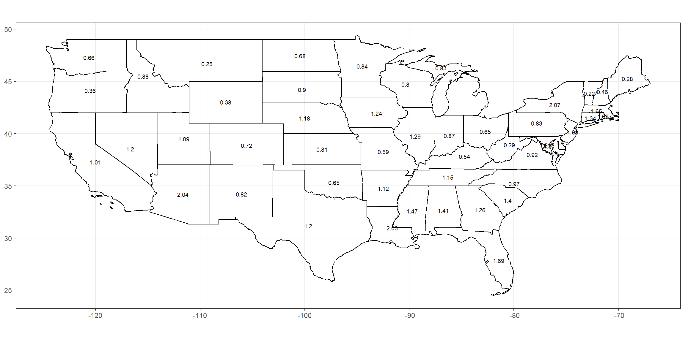
ggplot(data = prop_state) +
geom_sf(aes(geometry = geometry), fill = NA, color = "Black") + guides(color = FALSE) +
geom_text(aes(label = (as.numeric(case_pop)*100), geometry = geometry), stat = "sf_coordinates", color = "black", size = 2.5) +
theme_bw() +
theme(axis.title.x=element_blank(), axis.title.y=element_blank())
Above is another visualization, I’m going to highlight is found on the New York Times page. The data of prop_states is found on this projects github repo. The code is also above used to create the map. The code is using the R packages sf (simple figures), USAboundaries and ggplot2 (part of the tidyverse package) to create the map.
filter = 'top',
extensions = 'Buttons',
options = list(buttons = c('copy', 'csv', 'pdf'), #...
For both data sources I created a data table. They are found at in the Johns Hopkins University Leaflet page and New York Times page. Above is example code for the included features of my data table. The command filter = ‘top’ allow the data table to be filtered to view specific data. The buttons extension was allow the user to copy the data table or download the data table as a csv or pdf. The data tables are used to show the data used to create the visualizations and can be downloaded by the user to be used to recreate the visualizations.
Conclusions
My expected outcomes were to use data visualizations and documentation that is shown on a github website. I used have leaflets, dygraphs, ggplots and more visualization tools, to explain the data. The results are being shown using Rmd (RMarkdown) files that are put through knitr to get html. Yaml files were used to create the headers and javascript for the data website. This website helps people understand the data of COVID-19 using data tools such as visualizations. As people are aware and understand the data they can take appropriate actions.
Future Improvement
A few things I learned in this project. First, working with continuously updating data is hard unless you have an automatic run script. In the future I would setup a automatic run script to allow to always have up to date data. Another thing I learned and implemented in the end of the project was to create an R package to create global functions that can be used in every page of the data website. I the future I would create the R package at the beginning, then update it as the project progresses. This motivated me to create my own general use package full of useful functions, use install_github("kctolli/Useful") to install package. This project was a great learning experience for me and point to reflect on my data science skills.
Follow-up Questions
These are some questions I had when working on the project but was unable due to time or data restrictions.
- What is the what effects the distribution of cases or deaths by COVID-19?
- Age
- Gender
- Career/Job
- Has the number of people wearing a mask increased or decreased over the course of the virus?
- At the beginning toilet paper was in high demand. What is the supply and demand trend of toilet paper over the course of the virus?
- Does having preexisting conditions give a greater chance of dying or testing positive?
Data Integrity
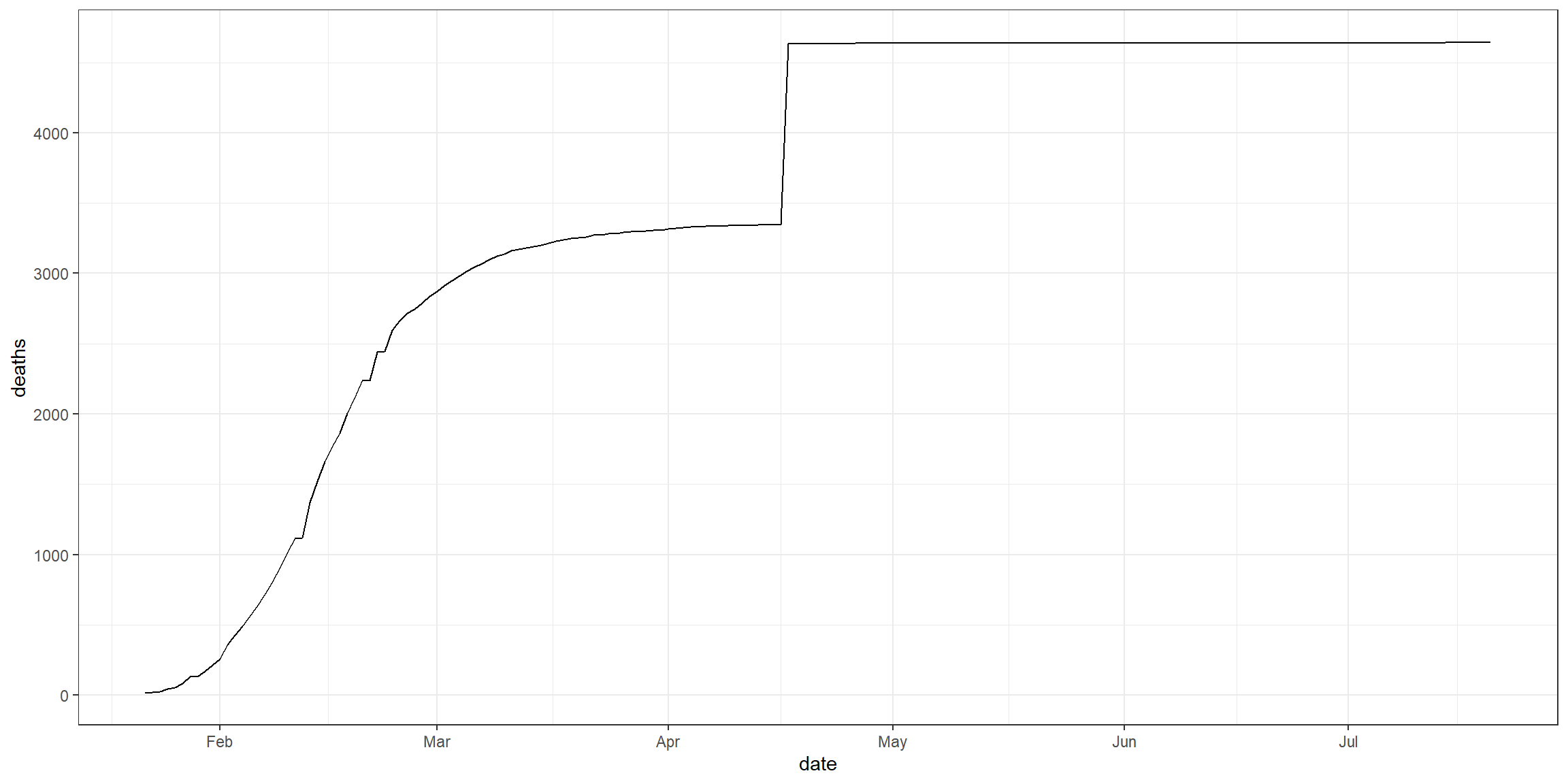
There was some flaws in the data over the course of the project. One flaw is was that Our World in Data corrupted the data. I find that really weird, why would they corrupt their own data. Another flaw is that I came across is that different datasets get updated at different times. Another flaw is shown in the graph above (China’s deaths over time) found on Johns Hopkins University Plot page. There is a great spike in death in the middle of April. China must of changed how they determine what is considered deaths which caused the great spike, it doesn’t seem realist to have such a jump in deaths. This is the integrity of my data I found.
Feedback
I was able to share my project with some family member and friends. They gave me some insists and feedback for the project and what to do moving forward. This feedback includes likes, dislikes, and wish I saws. This feedback format is based on the Visualization Critiquing structure in chapter 9 of Scott Berinato’s book, Good Charts, and taught in CSE 150, Data Intuition and Insight.
Likes
- Enjoyed the project
- Thought it looks good
- Impressive project
- Graphs are very good
- Deaths flattening in the USA is encouraging
Dislikes
- Data visualizations and report was dynamic instead of static
- See current hot spots instead of overall hot spots
- Work with current data instead of overall data
- Bad explanation of the trend line of cases vs deaths
- List the actual dates not just ranges
- Example: Total cases this week should be total cases this week, July10-17
Wish I Saws
- Have a R script or chunk to automate choosing the top 5 states on cases and deaths
- Set up a trend line to determine current trends
- Have a data alert system such as a data notification app or email
- What causes the spikes in cases and deaths
- Clearer titles
References
Dashboards
Coronavirus Pandemic (COVID-19) - Statistics and Research. (2020). Retrieved 2020,
from https://ourworldindata.org/coronavirus
Mapping COVID-19. (2020). Retrieved 2020,
from https://systems.jhu.edu/research/public-health/ncov/
Dataset References
CSSEGISandData. (2020). CSSEGISandData/COVID-19. Retrieved 2020,
from https://github.com/CSSEGISandData/COVID-19
Nytimes. (2020). Nytimes/covid-19-data. Retrieved 2020,
from https://github.com/nytimes/covid-19-data
Owid. (2020). Owid/covid-19-data. Retrieved 2020,
from https://github.com/owid/covid-19-data
Data Driven Learning
Babies - Netflix. (2020). Retrieved 2020,
from https://www.netflix.com/watch/80117834?trackId=13752289
Berinato, S. (2016). Good charts: The HBR guide to making smarter, more persuasive data visualizations.
Boston, MA: Harvard Business Review Press.
The Fallen of World War II - Data-driven documentary about war & peace. (n.d.). Retrieved 2020,
from http://www.fallen.io/ww2/
Additional Resourses
Grolemund, G. & Wickham, H. (n.d.). R for Data Science. Retrieved 2020,
from https://r4ds.had.co.nz/
Hathaway, J. (n.d.). Consulting Articles. Retrieved 2020,
from https://byuistats.github.io/M488/readings.html
Hathaway, J. (n.d.). R Visualization. Retrieved 2020,
from https://byuistats.github.io/M335/r_visualization.html
Henry, L. & Wickham, H. (n.d.). Tidy evaluation. Retrieved 2020,
from https://tidyeval.tidyverse.org/
Jenny Bryan, T. (n.d.). Happy Git and GitHub for the useR. Retrieved 2020,
from https://happygitwithr.com/
Sievert, C. (2019, December 19). Data visualization with R, plotly, and shiny. Retrieved 2020,
from https://plotly-r.com/index.html
Wickham, H. (n.d.). Advanced R. Retrieved 2020,
from https://adv-r.hadley.nz/
Wickham, H. & Bryan, J. (n.d.). R Packages. Retrieved 2020,
from https://r-pkgs.org/
Wilke, C. (n.d.). Fundamentals of Data Visualization. Retrieved 2020,
from https://serialmentor.com/dataviz/
— Personal Clockify API: XuhTtOx0CWcDM3ki